Your website's user interface isn't just about looking good—it's about converting visitors into customers. Every design decision either moves users toward conversion or creates friction that drives them away. Let's uncover the hidden UI barriers that are silently sabotaging your conversion rates and learn how to transform them into conversion catalysts.
Why Your Visitors Aren't Converting—And What Your UI Has to Do With It
Imagine walking into a well-lit store with clear signage, neatly arranged items, and an assistant who subtly guides you. Now picture the opposite—a cluttered, confusing mess with poor lighting and no direction. Which store are you likely to buy from?
That's your UI.
Your digital storefront determines success or failure
Your landing page is your digital storefront. Bad UI isn't just unattractive—it's a conversion killer. Let's explore the UI sins that silently sabotage performance, and how to fix them before they cost you thousands.
1. Cognitive Overload: When UI Becomes a Puzzle
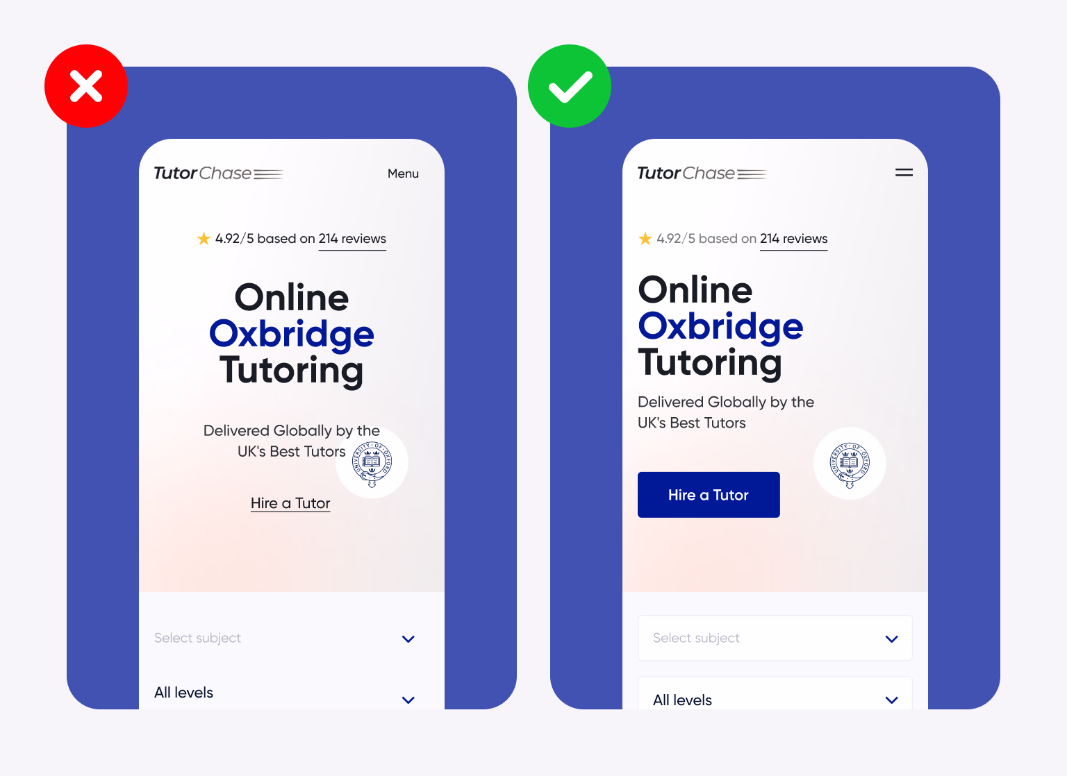
The average user spends less than 15 seconds on a landing page before deciding whether to stay or bounce. If your UI bombards them with multiple CTAs, mismatched colors, or overloaded visuals, you're demanding attention the brain doesn't want to give.
The Remote Control Analogy
It's like being handed five TV remotes with no labels. You just wanted to watch Netflix, but now you're overwhelmed and walk away.
Success Story: SaaS Startup Transformation
Original CTR with 3 CTAs
Increase after simplification
A SaaS startup had 3 CTAs above the fold: "Get Demo," "See Pricing," and "Start Free Trial." After simplifying to one high-contrast CTA and removing clutter, conversions jumped by 48%.
The Fix: Design Psychology Solutions
-
Embrace visual hierarchy. Make one action the hero—use size, color, and positioning to create a clear focal point.
-
Whitespace is not empty—it's breathing space. Allow content to breathe and guide the eye naturally.
-
Use the Z-pattern or F-pattern to guide the eyes naturally through your content hierarchy.
2. Unclear CTA Hierarchy
Call-to-action buttons are your closers. If they blend into the background, have vague labels like "Submit," or sit beneath the fold, users won't take the next step.
The Vanishing Waiter Problem
It's like a waiter dropping off a menu and never returning to take your order. You may like what you see, but you don't know how to proceed.
UI Red Flags
- Low contrast between CTA and background
- Generic copy ("Click here", "Submit")
- Inconsistent placement across devices
- Multiple competing primary actions
The Fix
- Use action-oriented language ("Start My Free Trial")
- Ensure CTAs contrast boldly and appear early
- Repeat CTAs contextually throughout the page
- Create visual priority with size and color


3. Mobile Neglect
The Mobile Reality
More than 55% of web traffic is mobile. Yet, many landing pages still treat mobile as a second-class citizen. Buttons are too small, text overlaps, or key content is hidden in accordions.
Real Case Study: eCommerce Mobile Crisis
Mobile Traffic
Lower Mobile CR
"Buy Now" Button
An eCommerce campaign saw 62% of traffic via mobile, but had a 2.9x lower conversion rate than desktop. The culprit? A hidden "Buy Now" button under a collapsed section that users never found.
The Fix: Mobile-First Strategy
-
Design mobile-first, not mobile-also. Start with the smallest screen and scale up.
-
Ensure thumb-friendly tap targets. Minimum 44px touch areas with adequate spacing.
-
Prioritize fast loading with responsive layouts that adapt gracefully to all screen sizes.
4. Slow Load Times = Lost Users
The Google Speed Study
According to Google, a 1-second delay in mobile load time can drop conversions by up to 20%.
Laggy animations, heavy JavaScript, or unoptimized images all contribute to this silent conversion killer.
The Closed Store Analogy
It's like entering a store, ringing the bell, and no one comes out for 10 seconds. You assume they're closed and leave.
The Fix: Performance Optimization
-
Lazy-load non-critical assets to prioritize above-the-fold content loading.
-
Compress images (use WebP or AVIF) for 60-80% size reduction without quality loss.
-
Use LCP and TTI metrics from PageSpeed Insights to identify and fix performance bottlenecks.

5. Inconsistent UI Language
Design elements—icons, button shapes, typography—should guide users seamlessly. But when different parts of your landing page use conflicting UI logic, it creates subconscious distrust.
The Trust Erosion Problem
Example: If your product cards have round buttons but your pricing table uses square ones, users may not trust what happens next when they click.
Inconsistency signals unprofessionalism and creates cognitive friction that reduces conversion rates.
The Fix: Design System Consistency
-
Establish a design system or component library with documented patterns and standards.
-
Use consistent design tokens for colors, fonts, spacing, and border radius across all elements.
-
Ensure all interactive elements follow predictable feedback behavior with consistent hover and active states.
6. Lack of Visual Cues for Scannability
People don't read—they scan. A wall of text or evenly weighted UI components makes it impossible for users to find what matters. Your interface must guide the eye through a logical hierarchy.
The Fix: Scannable Design Principles
-
Use visual cues: icons, badges, bold headings to create natural stopping points for scanning eyes.
-
Embrace modularity—break things into cards or sections to chunk information into digestible pieces.
-
Use scroll indicators or visual progress bars to show users where they are in their journey.
7. Ignoring UI Feedback Loops
Users want to feel their actions are recognized. If your UI doesn't acknowledge button clicks, form submissions, or loading states, they feel abandoned or unsure whether their action worked.
Clicking a CTA without feedback is like pressing an elevator button that doesn't light up—you're unsure if it worked and may press it multiple times or give up entirely.
The Fix: Micro-Interaction Magic
-
Use micro-interactions: loading spinners, checkmarks, subtle animations that confirm user actions.
-
Confirm form inputs or errors inline, not only after submission—real-time validation builds confidence.
-
Add success modals or redirect confirmations to close the feedback loop and guide next steps.

8. Information Asymmetry
Sometimes, key information—like pricing, guarantees, or next steps—is buried deep or hidden. If your users don't get clarity fast, they won't convert. Transparency builds trust, and trust drives conversions.
The Fix: Transparency First
-
Be transparent upfront—price, features, what happens next should be immediately visible.
-
Use accordions for secondary info, not primary—keep essential details always visible.
-
Include trust markers (reviews, security badges, guarantees) close to CTAs where decision-making happens.
9. Emotionally Flat UI
Your landing page looks "fine" but doesn't evoke anything. No surprise, no delight, no humor, no urgency. Flat design can be visually clean but emotionally dead. Users connect with brands that feel human.
The Fix: Emotional Connection
-
Inject personality in microcopy ("You're almost there!" instead of "Next Step") to create human moments.
-
Use illustrations or subtle animations to build mood and differentiate from competitors.
-
Try storytelling formats like problem → solution → result to create narrative engagement.
UI Isn't Cosmetic—It's Behavioral Design
The best-performing landing pages aren't the "prettiest." They're the ones that guide behavior, remove doubt, and reduce friction. That's what UI should do—influence decisions and drive actions.
Before you redesign, ask yourself:
Does my UI give clarity in 3 seconds?
Users should instantly understand what you offer and what action to take.
Can a first-time visitor complete the journey blindfolded?
Your UI should be so intuitive that the path forward is obvious.
Does my UI reduce user anxiety at decision points?
Trust signals, clear next steps, and risk reversals should ease concerns.
"Good UI doesn't make you think. Great UI makes you feel confident about what you're thinking." — Don Norman, Design of Everyday Things
Your 7-Day UI Conversion Audit Action Plan
Don't let these conversion killers sabotage your marketing spend. Here's your week-by-week action plan to fix these issues systematically:
Days 1-2: Mobile & Speed Audit
Foundation fixes for immediate impact
- Run PageSpeed Insights and fix Critical rendering path issues
- Test your entire flow on mobile devices (iPhone and Android)
- Compress images and implement lazy loading
Days 3-4: CTA & Visual Hierarchy
Focus user attention and actions
- Audit all CTAs for visibility, placement, and copy clarity
- Establish clear visual hierarchy with headings and white space
- Add visual cues and scannable formatting
Days 5-6: Consistency & Feedback
Polish the user experience
- Standardize UI elements (buttons, forms, colors) across pages
- Add micro-interactions and loading states
- Implement form validation and success confirmations
Day 7: Test & Measure
Validate improvements and optimize
- Run user testing sessions or heatmap analysis
- Set up conversion tracking and baseline metrics
- Plan A/B tests for major UI changes
Ready to transform your conversion rates but need expert guidance?
At Pinova, we specialize in conversion-focused UI design that turns visitors into customers. Our systematic approach has helped dozens of businesses increase their conversion rates by 40-200%.


