Okay, let's settle in and talk about something fundamental to your online success today: Responsive Web Design. You might have heard the term thrown around, but understanding why it's not just a trend, but a necessity – and how deeply it impacts whether people find you and whether they take action on your site – is absolutely crucial.
Think about how you browse the internet. Chances are, you switch seamlessly between your desktop computer at work, your tablet on the couch, and your smartphone on the go. Now, imagine landing on a website on your phone that looks like a miniature version of the desktop site. You're pinching and zooming to read tiny text, trying desperately to tap a minuscule button, maybe scrolling sideways because the layout is wider than your screen. Frustrating, right? Annoying enough to make you hit the back button and try the next search result? Absolutely.
This is where Responsive Web Design (RWD) comes in, and trust me, getting it right is one of the single best investments you can make in your online presence. It's the quiet hero working behind the scenes to make your website welcoming and functional for everyone, everywhere, on every device. And that welcome mat? It dramatically affects your visibility on search engines (SEO) and your ability to turn visitors into customers (Lead Generation).
The Foundation: What Exactly is Responsive Web Design?
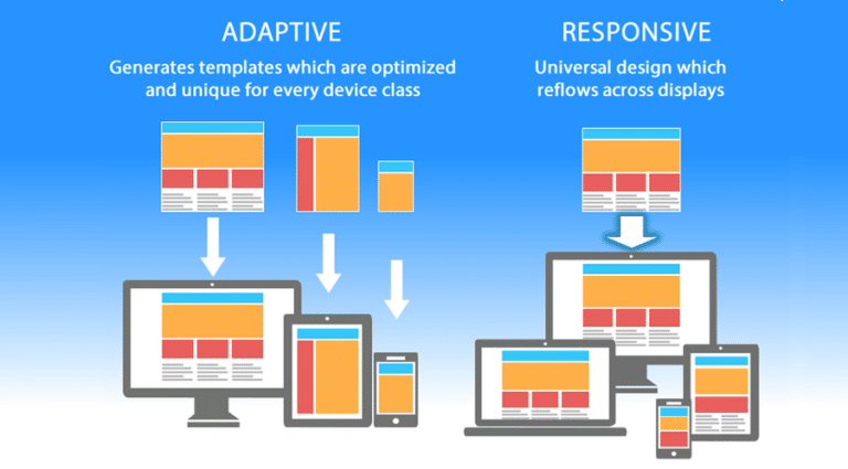
Before we dive into the impact, let's quickly define RWD. In simple terms, it's an approach to web design that makes web pages render well on a variety of devices and screen sizes. Instead of building separate websites for desktop, tablet, and mobile, you build one website. This single site uses flexible layouts, images, and CSS media queries to automatically adapt its appearance and functionality based on the screen characteristics of the device being used.
Think of it like water. You pour water into a glass, it takes the shape of the glass. You pour it into a bottle, it takes the shape of the bottle. Responsive design makes your website act like that water – fluidly adapting to fit the "container" (the screen) it's being viewed in.
This is fundamentally different from older methods like having a separate m.yourwebsite.com for mobile. While those served a purpose for a time, RWD has emerged as the superior, industry-standard approach.
The SEO Powerhouse: How RWD Boosts Your Search Rankings
Google, and other search engines, exist to provide users with the best possible results for their queries. And in a world where more and more searches happen on mobile devices, a site that works well on mobile is a better result. Google hasn't been shy about this; they actively reward mobile-friendly sites. Here's how RWD specifically impacts your SEO:
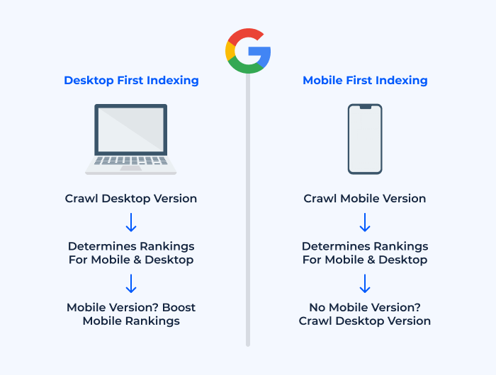
1. Mobile-First Indexing: Google Lives on Mobile Now
This is massive. For years, Google primarily used the desktop version of your content to understand and index your site. But recognizing the shift in user behavior, Google transitioned to "mobile-first indexing." This means they primarily use the mobile version of your website's content for indexing and ranking.
The RWD Advantage:
With RWD, you don't have separate desktop and mobile versions with potentially different content. You have one version that adapts. This ensures that the content Google sees when crawling (the mobile version) is the same rich, comprehensive content your users on desktop see, preventing any potential issues with Google not seeing your full content or features on mobile.
2. User Experience (UX) is a Ranking Factor, and RWD Rocks UX
Google explicitly states that user experience is a ranking signal. If users land on your site and have a terrible time – finding it hard to navigate, slow to load, or visually broken – they'll leave quickly (high bounce rate). Google notices this behavior. A high bounce rate can signal to Google that your site isn't providing a good experience, potentially leading to lower rankings.
The RWD Advantage:
By adapting layout, navigation, and content presentation to the user's device, RWD dramatically improves UX on phones and tablets. Buttons are tappable, text is readable without zooming, navigation is intuitive (often using mobile-specific patterns like hamburger menus).
Example:
Think of an online recipe blog. If a user searches for "chocolate chip cookie recipe" on their phone while in the kitchen, they need to be able to easily scroll through ingredients and instructions on their small screen, maybe even tapping checkboxes. A non-responsive site makes this a nightmare. A responsive site provides a clean, scrollable list, making the user's task simple and enjoyable. Google sees that users stay longer on the responsive site compared to the non-responsive competitor.
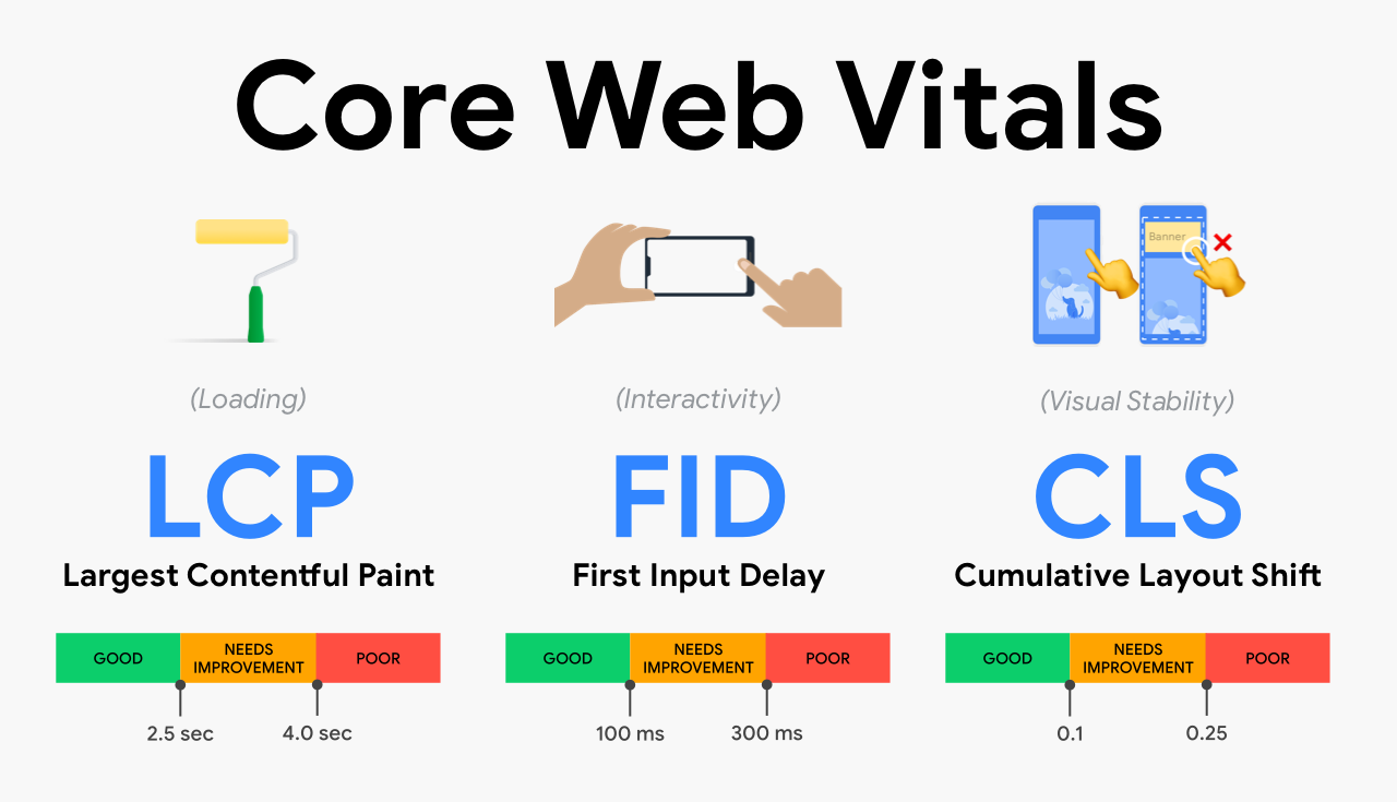
3. Core Web Vitals (CWV): The Need for Speed and Stability
Core Web Vitals are specific metrics Google uses to measure user experience, focusing on loading speed, interactivity, and visual stability. They are crucial ranking factors.
-
✓
Largest Contentful Paint (LCP): Measures how long it takes for the largest content element on the page to become visible.
-
✓
First Input Delay (FID) / Interaction to Next Paint (INP): Measures the time from when a user first interacts with a page to the time the browser is able to begin processing that interaction.
-
✓
Cumulative Layout Shift (CLS): Measures how much the content on the page jumps around unexpectedly while the page is loading.
The RWD Advantage:
While not automatically guaranteed by RWD alone (poorly implemented RWD can still be slow), a well-executed responsive design lays the groundwork for strong CWV scores. RWD allows you to serve appropriately sized images and assets for each device, speeding up loading. Responsive sites often have simpler, optimized codebases compared to maintaining separate sites.
4. Site Speed: Faster Sites Rank Higher
Page speed has been a direct ranking factor for a long time, and it's only becoming more important. Users abandon slow sites, and search engines know it.
The RWD Advantage:
RWD facilitates delivering optimized assets based on the device. Serving smaller, lower-resolution images to mobile phones and larger ones to desktops is a common RWD technique that dramatically reduces load times on mobile networks.
5. Lower Bounce Rate & Higher Dwell Time = More Engagement Signals
When users find your site easy to use and quickly find what they're looking for on their device, they are less likely to "bounce" back to the search results and more likely to spend time exploring different pages.
The RWD Advantage:
A frustration-free experience encourages exploration. If navigating your site is simple on a phone, a user looking for a service might check out your "About Us" page and "Testimonials" after initially landing on the "Services" page.
6. Simplified SEO Management
Managing SEO for a single, responsive website is exponentially simpler than managing SEO for a desktop site and a separate mobile site.
The RWD Advantage:
- One URL: You only have one URL for each piece of content, avoiding issues with duplicate content or needing complex rel="canonical" and rel="alternate" tags.
- One Content Strategy: You focus on creating one set of high-quality content, knowing it will be accessible and display well on all devices.
- One Link Building Strategy: Backlinks pointing to your single URL benefit all users, regardless of device.
7. Improved Local SEO
Mobile searches often have local intent ("coffee shop near me," "plumber in [City]"). RWD is vital for capturing this traffic.
The RWD Advantage:
Ensuring your contact information, map, directions, and opening hours are easily found and usable on a mobile device is paramount for local searchers. RWD makes this information prominent and the click-to-call buttons or map integrations functional on phones.
The Lead Generation Engine: How RWD Boosts Your Conversions
SEO gets people to your digital doorstep. Responsive design ensures that once they arrive, they have a pleasant experience that encourages them to come inside, look around, and ultimately, take action – whether that's filling out a contact form, making a purchase, signing up for a newsletter, or calling you. This is the core of lead generation.
1. Seamless User Journey Across Devices
Potential customers might interact with your brand multiple times on different devices before converting. They might find you on their phone during a commute, revisit on their desktop at work, and finally convert on their tablet in the evening.
The RWD Advantage:
RWD provides a consistent experience across all touchpoints. The layout, navigation, and branding look familiar, reducing friction and building trust as the user moves from one device to another.
Story:
Mark is looking for a digital marketing agency. He searches on his phone during lunch, finds your site (thanks to your great mobile SEO!), and bookmarks it. Later, on his desktop, he pulls up the bookmark. If the site is responsive, it looks familiar and professional. He easily finds the "Our Services" page and then the contact form. If the site wasn't responsive on mobile, he might not have bookmarked it in the first place, or found the desktop version jarring and left.
2. Improved User Experience = Higher Conversion Rates
This is the most direct link. A site that is easy and enjoyable to use converts better. Period.
The RWD Advantage:
- Usable Forms: Filling out forms on a non-responsive site is a nightmare. RWD ensures form fields are large enough to tap, keyboards bring up the right input type, and submit buttons are easily clickable.
- Clear Calls to Action (CTAs): RWD allows you to optimize the size and placement of your buttons and CTAs for each screen size, ensuring they are prominent and easy to interact with.
- Effortless Navigation: Users can quickly find the information they need, leading them down the conversion funnel without frustration.
- Readable Content: If users can easily read your value proposition, product descriptions, or service details on their device, they are more likely to be convinced.
3. Consistent Branding & Professionalism
Your website is often the first impression a potential customer has of your business. What does that impression say if your site looks broken or outdated on their primary device?
The RWD Advantage:
RWD ensures your brand identity – your logo, colors, fonts, tone, and overall aesthetic – remains consistent across all devices. This reinforces your brand image, builds trust, and makes your business look professional and competent.
4. Faster Load Times = Less Abandonment on Landing Pages
Landing pages are built for one purpose: conversion. If your landing page is slow to load on mobile, users will abandon it before they even see your compelling offer.
The RWD Advantage:
As discussed with SEO, RWD facilitates faster loading, which is absolutely critical for landing page performance, especially on mobile networks. Every second counts. A fast-loading, responsive landing page maximizes the chances that a user stays long enough to read your pitch and convert.
5. Better Analytics and Data-Driven Optimization
Managing separate sites requires separate analytics tracking, making it harder to get a holistic view of user behavior across devices.
The RWD Advantage:
With a single responsive site, all your user data for different devices flows into one analytics property (like Google Analytics). This provides a unified view of how users interact with your content and conversion funnels regardless of device. This centralized data makes it much easier to identify bottlenecks, understand user journeys, and make informed, data-driven decisions.
The Process and the Results: Making the Shift to Responsive
So, how do you make the move to responsive design, and what can you expect?
The Process (Simplified):
-
1
Audit Your Current Site
Analyze your analytics. What percentage of traffic is mobile/tablet? What are the bounce rates per device? Where are users dropping off on mobile? Use Google's Mobile-Friendly Test and PageSpeed Insights to see your site's current mobile performance.
-
2
Choose Your Approach
Are you building a brand new site? Redesigning an existing one? Or updating a theme? Building responsive from scratch is easiest, but often a strategic redesign or theme update is feasible.
-
3
Design with Mobile-First
Start the design process by thinking about the smallest screen first. What is the absolute essential content and functionality? Then, progressively enhance the design for larger screens. This ensures the core experience is solid on mobile.
-
4
Develop Using Flexible Grids, Images, and Media Queries
This is the technical core of RWD. Using relative units (like percentages) for layouts, making images scale proportionally, and using CSS media queries to apply different styles at specific screen widths (breakpoints).
-
5
Rigorous Testing
Test your site on actual devices (not just simulators!) across different screen sizes, operating systems, and browsers. Check layout, functionality, forms, and speed on each.
-
6
Launch and Monitor
Deploy your responsive site. Immediately start monitoring your analytics and Google Search Console. Look for changes in mobile rankings, mobile traffic, bounce rates, dwell time, and most importantly, mobile conversion rates and leads generated.
The Results You Can Expect:
-
✓
Significant increase in organic mobile traffic
-
✓
Improved search engine rankings, especially for mobile searches
-
✓
Measurable decrease in mobile bounce rates
-
✓
Increase in time spent on site by mobile users
-
✓
Higher conversion rates from mobile traffic
-
✓
Overall increase in lead generation or online sales
-
✓
Simplified website maintenance and SEO efforts
Story of Results:
Sarah, a bakery owner, invested in a responsive redesign for her website. Within three months, her mobile traffic from organic search increased by 40%. Her mobile bounce rate dropped from over 60% to under 30%. Most excitingly, online inquiries for custom cake orders, which often started on mobile, increased by 25%. The investment quickly paid for itself through increased business directly attributable to a better mobile experience.
Conclusion: RWD is Not Optional – It's Essential for Growth
In today's multi-device world, responsive web design is no longer a cutting-edge feature; it's a fundamental requirement for online success. Its impact ripples through every aspect of your online presence, from whether people can find you on Google to whether they choose to do business with you.
For SEO, RWD aligns you with Google's mobile-first approach, improves crucial user experience signals like Core Web Vitals, speeds up your site, and simplifies your overall optimization strategy.
For Lead Generation, RWD removes friction points, makes your site easy and enjoyable to use on any device, builds credibility through consistent professionalism, and ultimately guides users more effectively towards becoming valuable leads and customers.
Advanced Social Media Strategy Tip
While implementing your responsive design strategy, don't overlook the power of Dark Social in your marketing efforts. Dark Social refers to web traffic that comes from private channels like messaging apps, email, or text messages—places where tracking is difficult. As users increasingly share content through private channels rather than public social media, understanding this phenomenon becomes crucial for accurate attribution and effective marketing strategy.
Ignoring responsive design in 2025 is akin to having a brick-and-mortar store with a door too small for half your potential customers to walk through. You're simply shutting the door on a massive portion of your audience and making it harder for search engines to recommend you.
Invest in responsive design. It's an investment in your user experience, your search visibility, and the growth of your business. It's about meeting your audience where they are, respecting how they choose to browse, and providing them with a seamless, positive experience that keeps them coming back and encourages them to connect with you. It's the human touch, translated into code and design, and it's incredibly powerful.
