Dark mode, once a fringe choice among developers and power users, has become a fundamental aspect of digital product design. Its evolution is tightly bound with not just visual aesthetics but also user psychology, display hardware innovations, and accessibility compliance. In this deep dive, we explore its multidimensional impact, guiding principles, and technical considerations for implementing a high-performance, user-friendly dark mode—especially in SaaS products, dashboards, and mobile applications.
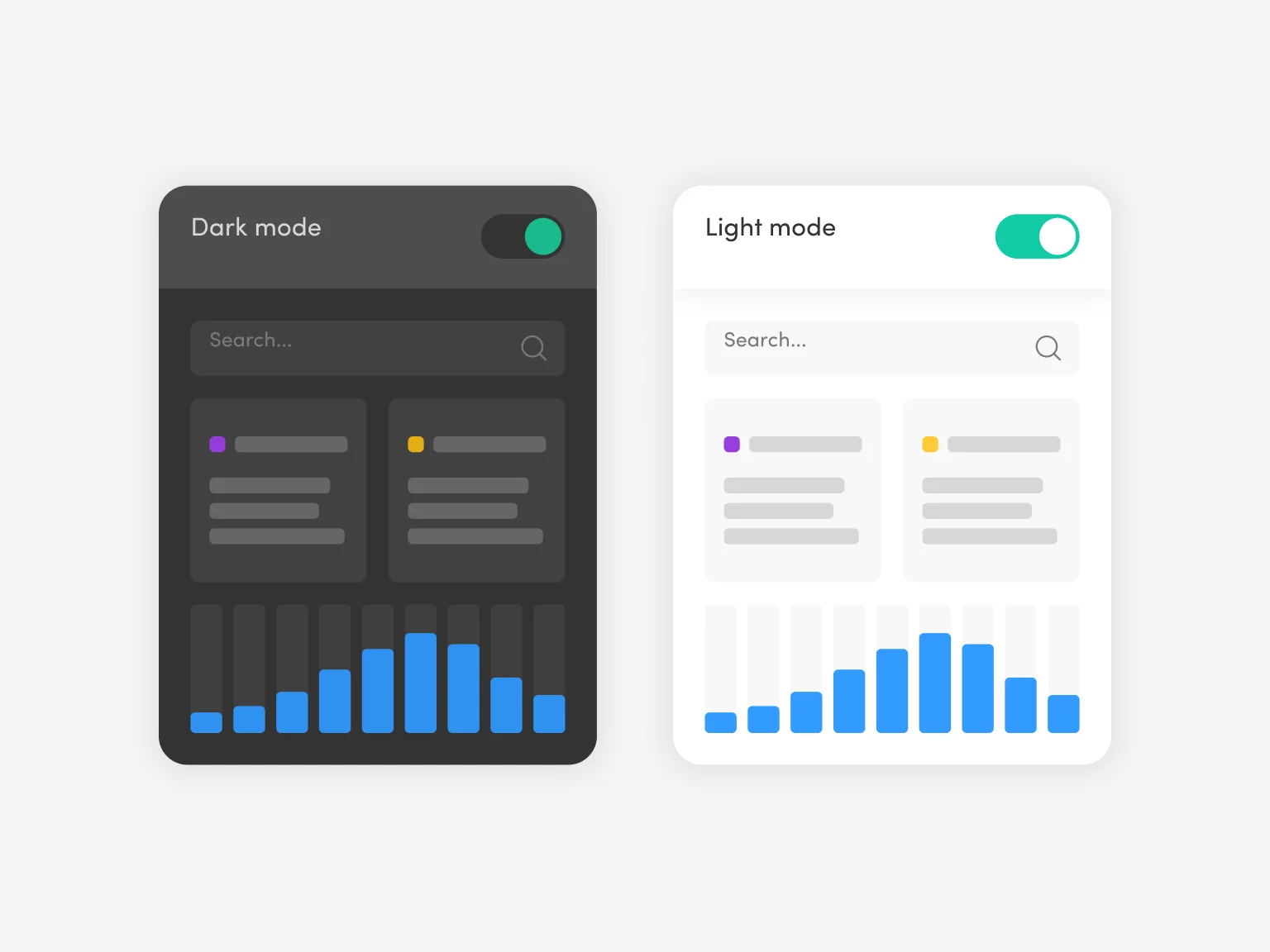
Human Visual Perception & Dark Mode
Dark mode usage is largely governed by how our eyes interact with light. The human retina comprises rod and cone cells; rods are sensitive to light and help us see in dim settings. Excessive light from white backgrounds strains the rods, especially in dark environments. Consequently, users report less eye fatigue in dark interfaces, particularly when the UI is designed with optimal contrast levels.
Display Technology Benefits:
- OLED and AMOLED displays emit less power in black pixels
- Dark UI becomes both comfort feature and power optimization strategy
- Reduced blue light emission helps maintain melatonin levels for better sleep cycles
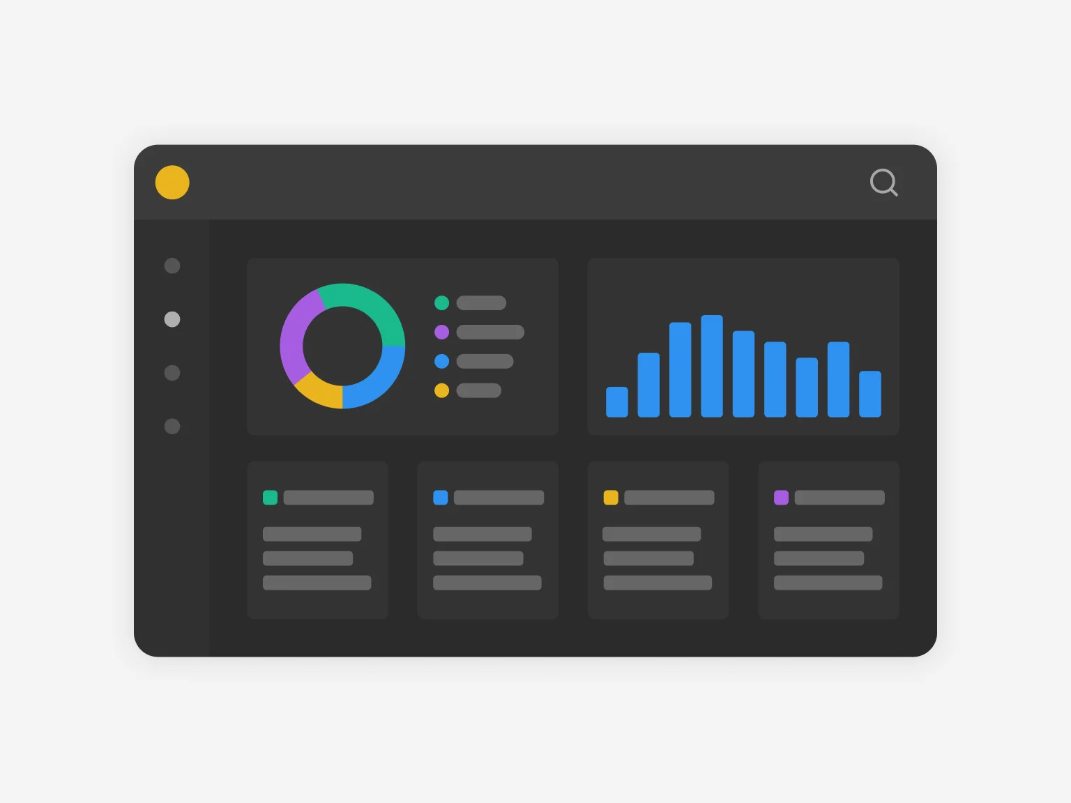
System Architecture: Implementing Dark Mode
Theming Architecture via Design Tokens
Building dark mode at scale demands a tokenized design system. Each color, spacing unit, and visual variable must be abstracted into semantic tokens—e.g., color-background-primary, color-text-secondary. These tokens are mapped to values in both light and dark themes, ensuring that design consistency is maintained across components, platforms, and future iterations.
Implementation Strategy:
Tokens should be integrated into CSS-in-JS libraries or preprocessors like Sass. For scalability, use configuration-based theming systems like Tailwind's darkMode: 'class' or use CSS custom properties if using vanilla CSS.
Dynamic Theme Switching
Modern implementations detect system preference using the prefers-color-scheme media query:
@media (prefers-color-scheme: dark) {
  body {
    background-color: #121212;
    color: #e0e0e0;
  }
}
Allowing users to toggle themes manually through UI controls ensures accessibility. Store preferences in localStorage or persist to the backend if user accounts exist.
Accessibility Compliance
Critical Considerations:
Dark UIs often fail WCAG contrast guidelines. A minimum contrast ratio of 4.5:1 for normal text and 3:1 for large text is essential. Text-on-dark should avoid pure white (#ffffff) on black backgrounds, as this increases luminance contrast and leads to halation.
Instead, use softer tones like #e0e0e0 on #121212.
Assistive technologies like screen readers should be tested with both themes, as color-based cues (e.g., success states in green) must be supplemented with icons or labels for clarity.
UI & UX Optimization
Shadow Behavior
In dark mode, shadows require recalibration. A common mistake is using the same elevation shadows from light mode. Instead of dark shadows, simulate elevation with lighter glows:
box-shadow: 0 2px 8px rgba(255, 255, 255, 0.1);
Gradients & Highlighting
Light gradients can flatten UI in dark mode. Use subtle color variations and slightly translucent borders for depth. For example:
border: 1px solid rgba(255, 255, 255, 0.08);
Hover states and interactive elements should use low-saturation, high-luminance accents—like deep violet or teal—avoiding stark color pops unless consistent with branding.
Platform Integration & Frameworks
React / Next.js
Implement context-based theming with styled-components or Emotion. Use ThemeProvider to toggle between light and dark themes.
Flutter
Utilize ThemeData.dark() with Provider for state management.
Webflow / No-Code
Requires duplication of styles with conditional visibility. Not scalable, but sufficient for marketing websites.
For enterprise and SaaS dashboards, integrate Figma tokens directly with code using tools like Style Dictionary or Tokens Studio to maintain design-dev parity.
Performance Impacts
Dark mode can marginally reduce CPU/GPU load when used on OLED displays due to lower power draw for dark pixels. Also, if implemented with efficient CSS variables and without unnecessary re-rendering of components, theme switching can be lightweight with minimal layout thrashing.
Ensure all animations during mode switching are GPU-accelerated usingtransformandopacity, notwidthortop, for a smooth experience.
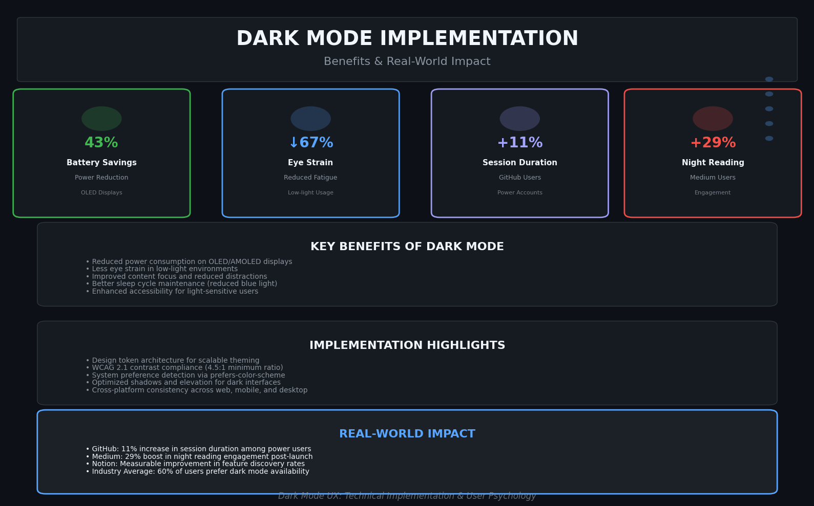
Behavioral Metrics & Real-World Impact
These stats highlight that dark mode isn't merely cosmetic—it influences usage patterns and content consumption depth:
GitHub
Increase in session duration among dark mode users within power accounts, leading to improved developer productivity.
Medium
Jump in night reading engagement post-dark mode launch, enhancing user experience during evening hours.
Notion
Measurable uptick in feature discovery due to enhanced icon and label clarity in dark mode interface.
Future State: Where It's Going
Dark mode is evolving toward context-aware theming, where UI dynamically adjusts based on the user's location, ambient lighting, or time zone. Using sensors (like ambient light sensors), apps could shift to a mid-tone palette rather than binary light/dark modes.
Moreover, adaptive designs will allow modular sections of an app to follow their own contrast schema—e.g., a graph-heavy dashboard could retain a dark visualization area while using a lighter sidebar for content entry.
SEO & Content Optimization Strategy
Focus on high-intent and long-tail keywords:
Content Strategy Tips:
- Interlink with performance, accessibility, and design system content
- Incorporate real product screenshots and code snippets
- Focus on improving crawl depth and topical authority
Final Word
Dark mode is no longer optional. It's a core part of the design decision-making process. From accessibility to battery optimization, user engagement to aesthetic personalization, it plays a role in everything from user retention to brand identity.
Implementing dark mode well—both technically and experientially—signals attention to detail, user respect, and product maturity. And for SaaS platforms or digital products competing globally, that can make all the difference.
Interested in a dark mode UX audit or implementation strategy for your product?
